
DON’T be an NPC* is a campaign designed as a (civic) personality quiz, created to combat low participation and social conformism in Portugal. Our goal is to break the collective inertia and alienation that often distance us from our own…
Tag: Coated paper
Archive Magazine — Miguel Adrover

Archive Magazine is an editorial project conceived as a publication devoted to the work of designers and artists through the construction of individual archives. Each issue gathers and organizes content related to one author’s path and output, creating a publication…
Arquivos de Gestos

The starting point was the side view of the page edges of well-used sketchbooks, overflowing with textures and colors that naturally form a mark. Developed for Advanced Studies in Editorial Design and Typography, in response to a brief for a…
The Design Issue
An experimental editorial publication for Advanced Studies in Editorial Design and Typography, starting from the relationship between typography, discourse and design. It explores typography’s ability to act not only as a vehicle for content but as a visual, expressive and…
Backstage

Backstage is a serif typeface in the Garalde tradition, developed from the observation and reinterpretation of Garamond. While it keeps the legibility, proportion and elegance associated with Renaissance models, its design introduces a more vertical structure, more defined serifs and…
Echo_Type – Where Design Resonates
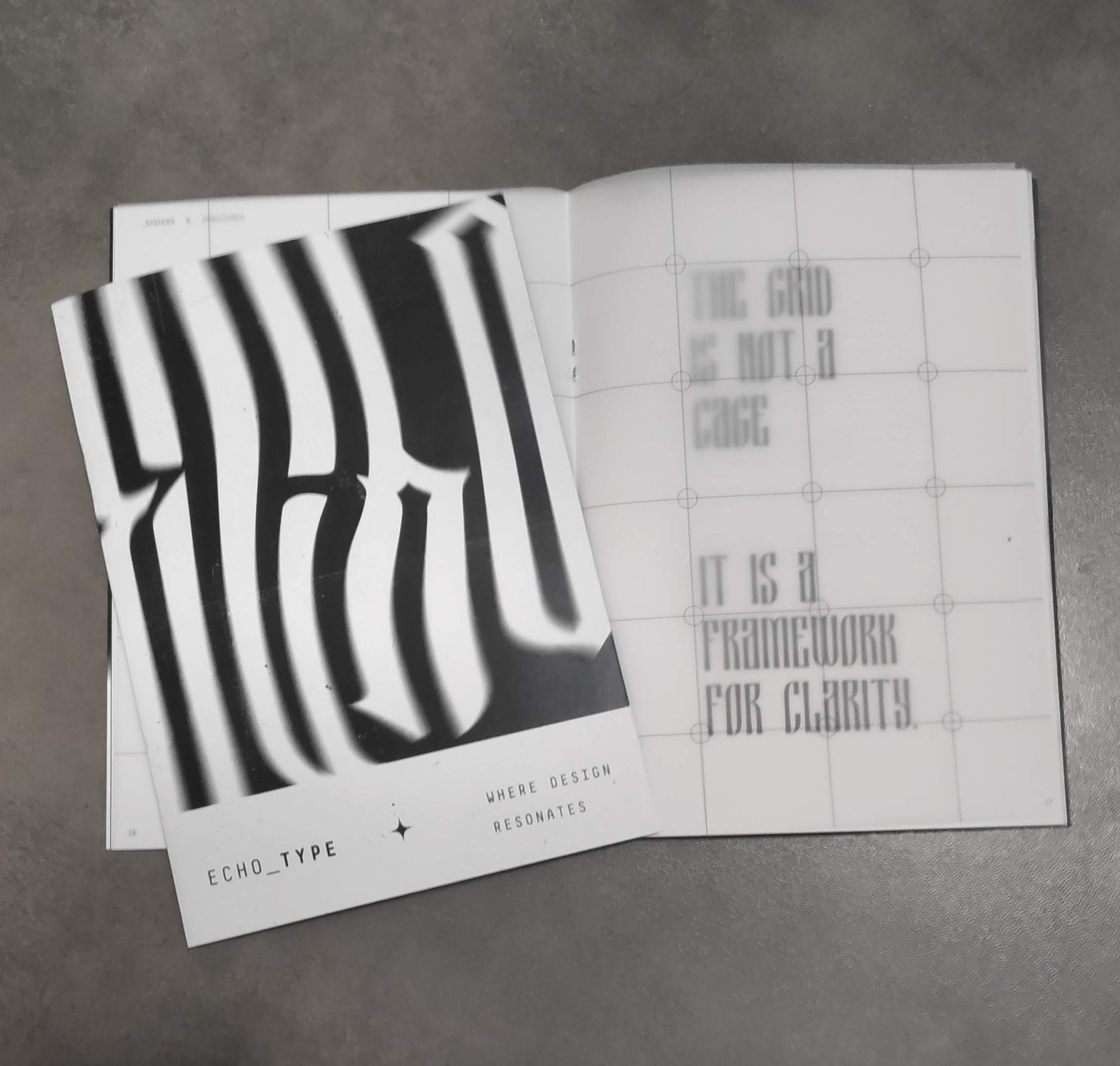
An editorial magazine developed from a set of articles provided by Professor Mário Moura for Advanced Studies in Editorial Design and Typography. The publication takes an exclusively typographic approach, with no images and limited to black and white.
Guide to Get Lost

Guide to Get Lost is an illustration project conceived as a comic, informal and poetic guide to getting lost on purpose. Instead of leading the reader to a destination, it values the unknown, chance, freedom and discovering new experiences along…
Não Pedi Para ser adulto

Developed for Illustration Contexts and Practices, this project created an illustrated narrative from an everyday object, transforming it and exploring its narrative and symbolic potential.
Amália Font

This project is a type revival based on the analysis and interpretation of an original historical model. It aims to reinterpret the formal and conceptual characteristics of the reference typeface and adapt them to contemporary needs and contexts through a…
The amulet, the talisman, the charm

This editorial project arose in the Project curricular unit, within a collaborative dynamic that simulates the relationship between client and designer: one group develops the concept and the initial content, while the other develops it and turns it into a…