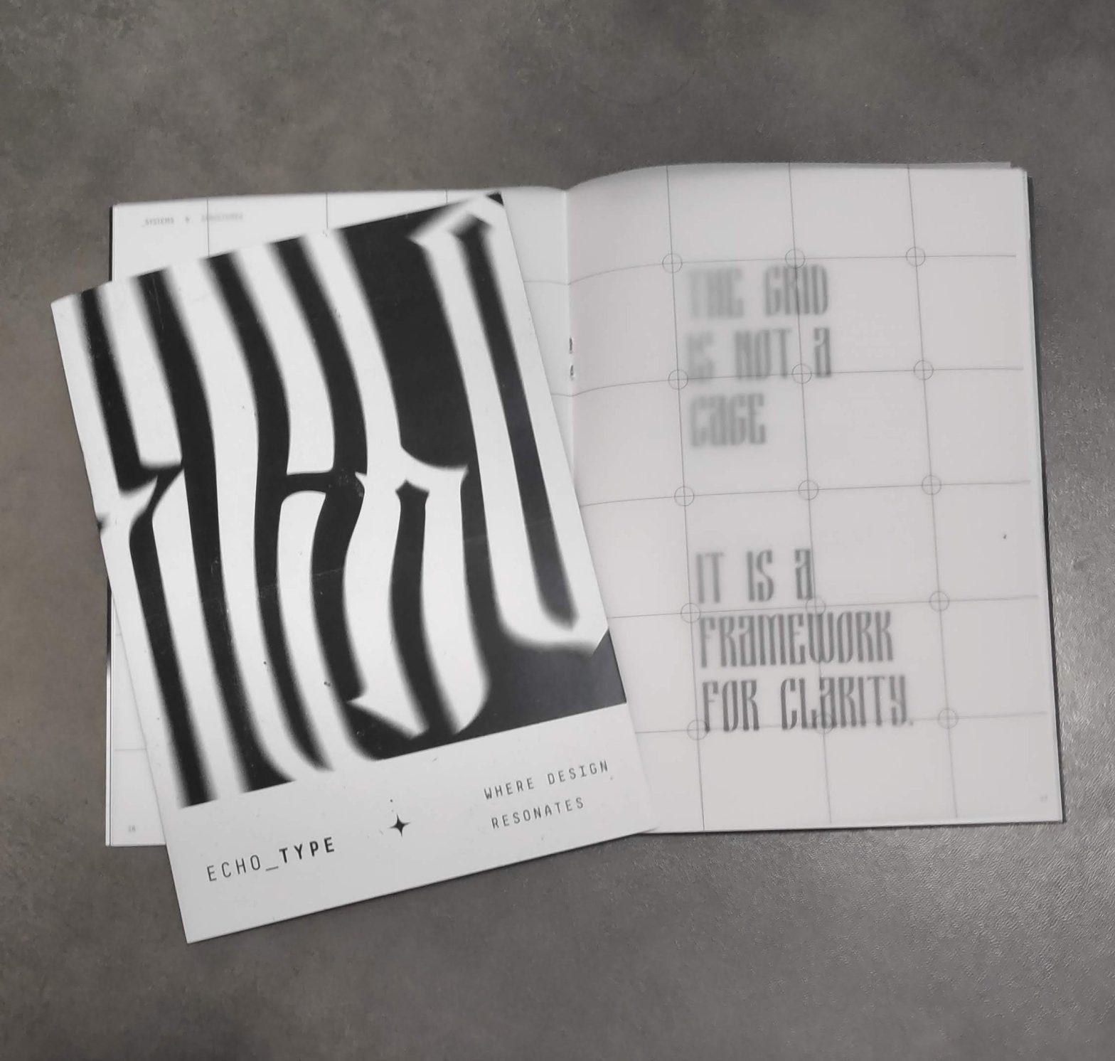
Echo_Type – Where Design Resonates
Isa Imay
An editorial magazine developed from a set of articles provided by Professor Mário Moura for Advanced Studies in Editorial Design and Typography. The publication takes an exclusively typographic approach, with no images and limited to black and white.
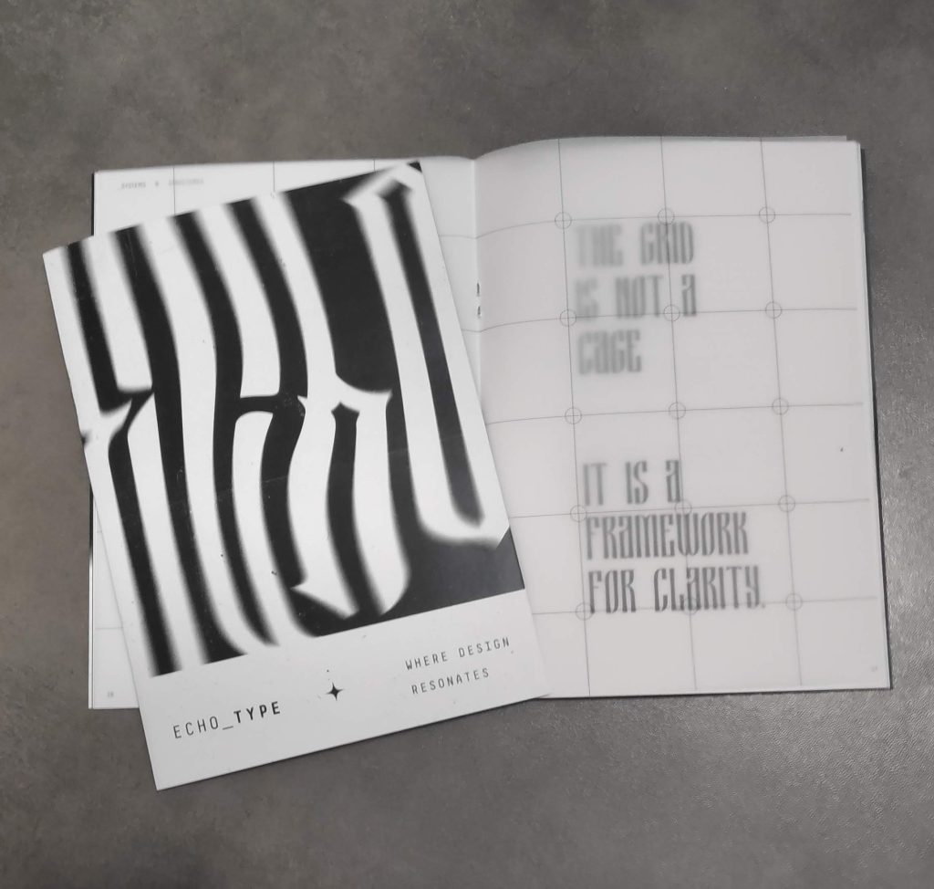
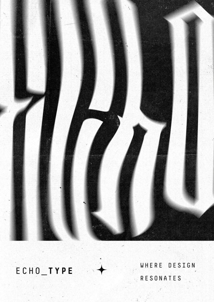
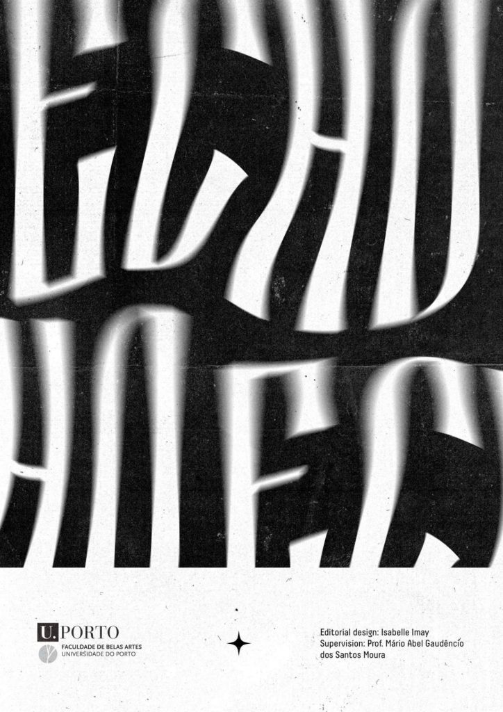
The magazine’s visual identity grew from exploring blackletter typefaces, chosen for their striking formal qualities: visual weight and strong graphic personality, well suited to the project’s chromatic constraints. In the absence of imagery, lettering was drawn in Illustrator and manipulated with effects in Photoshop, used as decorative and compositional elements.
Different typefaces were used to structure the pages of each article, establishing formal relationships between content and composition. One typeface had a star-like symbol within the letter “O”, which was appropriated and turned into a recurring graphic element. The graphic language was complemented by textures and noise, used as compositional resources and to add depth to the black surfaces.
As an experiment in reader interaction, a tracing-paper page was created for the article “Typography is a Grid”, reproducing the grid used in its composition so the underlying structure of the page can be overlaid and seen.
Imprint / Technical Rider:
Year: 2025
Dimensions: 148 × 210 mm; 30 pages
Materials: Cover on matte coated 120 g; text block on matte coated 90 g.
Production and finishing: Stapled binding; black-and-white digital printing.
Resources and credits: Textures and effects in Adobe Photoshop CC 2025, layout in Adobe InDesign CC 2025, details in Adobe Illustrator CC 2025.
Curricular Unit:
Advanced Studies in Editorial Design and Typography (1st year)
Supervising Professor:
Mário Moura
Keywords: Blackletter, Typographic Experimentation, Grid
See this project in the Material Archive interactive archive →