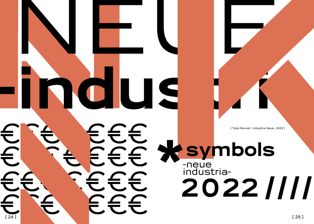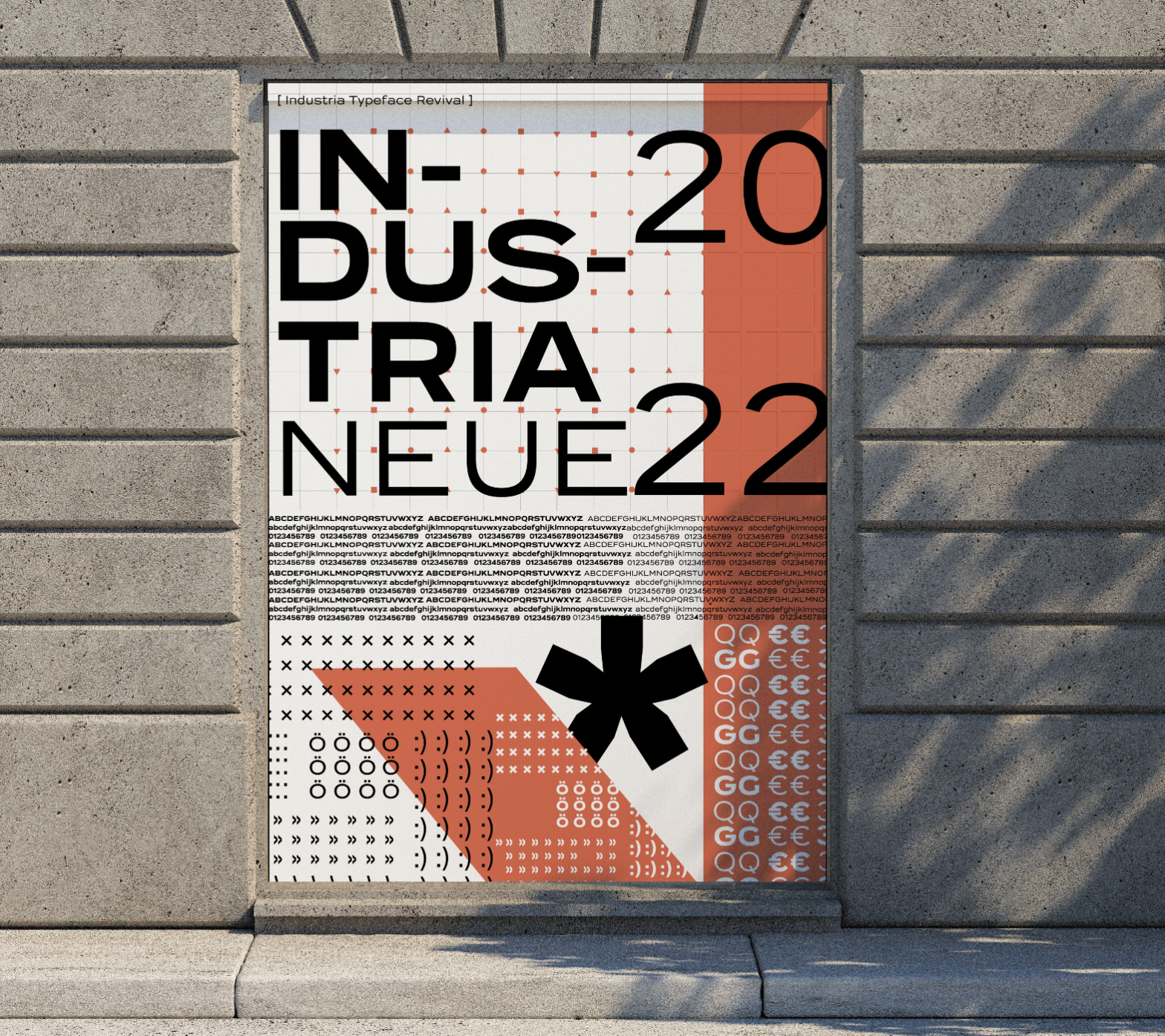
Industria Neue digital typeface revival developed by Inês Venâncio, Raquel Clemente, Sara Guerra under the supervision of Professor Pedro Amado, within the Typeface Design course, in the academic year 2021-22.
Industria Neue appears as an updated version of the “Industria” font designed by Hermann Zehnpfundt and launched by Emil Gursch’s Foundry in 1910. There are a few specimens or archives in which the original font is present, and its potential has not been much explored at the time of its creation. Thus, this was the main reason that spurred the development of a revival.
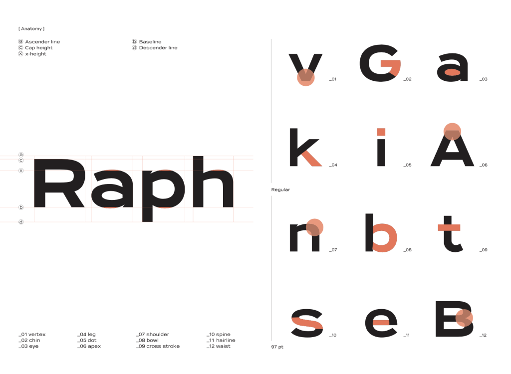
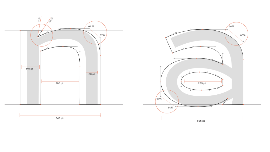
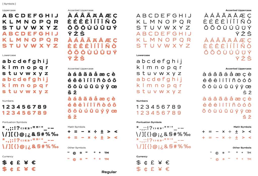
The concept boils down to giving value to this typography associated with the Bauhaus school for its geometric approach, however, always maintaining the commitment to experimentation. Not extremely because of the drive to abolish capital letters, but because of the radical way it is used: an extra large and heavy typeface, with the regular version being purposefully seen as bold. Some adjustments were made to improve the original font, namely ink traps, in order to avoid excess ink in intersection areas, and improvement of the original shapes for greater visual coherence. According to the Vox-ATypI classification, Industria Neue is classified as Lineal (Sans-serif), Grotesque.