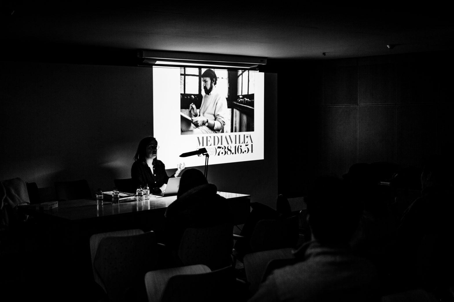
Last Monday, the 27th of November 2023, we had Prof. Sónia da Rocha at FBAUP, visiting from the ESAD.Har.
She had been in Portugal for a few institutional visits and, of course, to attend the fantastic Typography Meeting at the University Lusófona in Lisbon the previous weekend. We had had the opportunity to catch up and prepare beforehand, but the conference she delivered was genuinely inspiring.
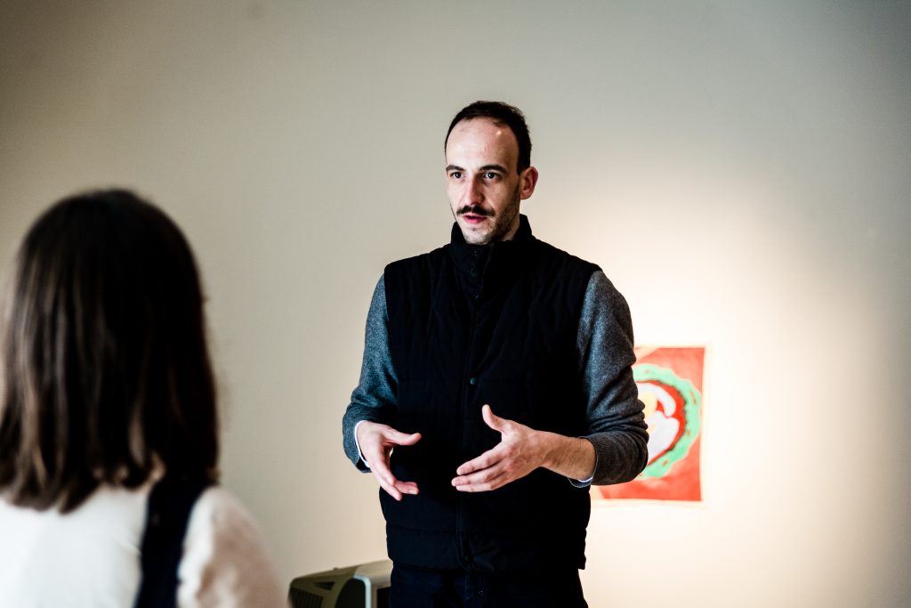
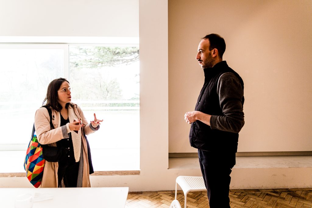
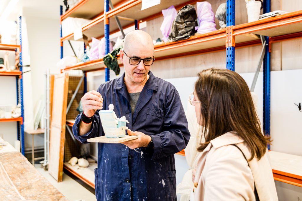

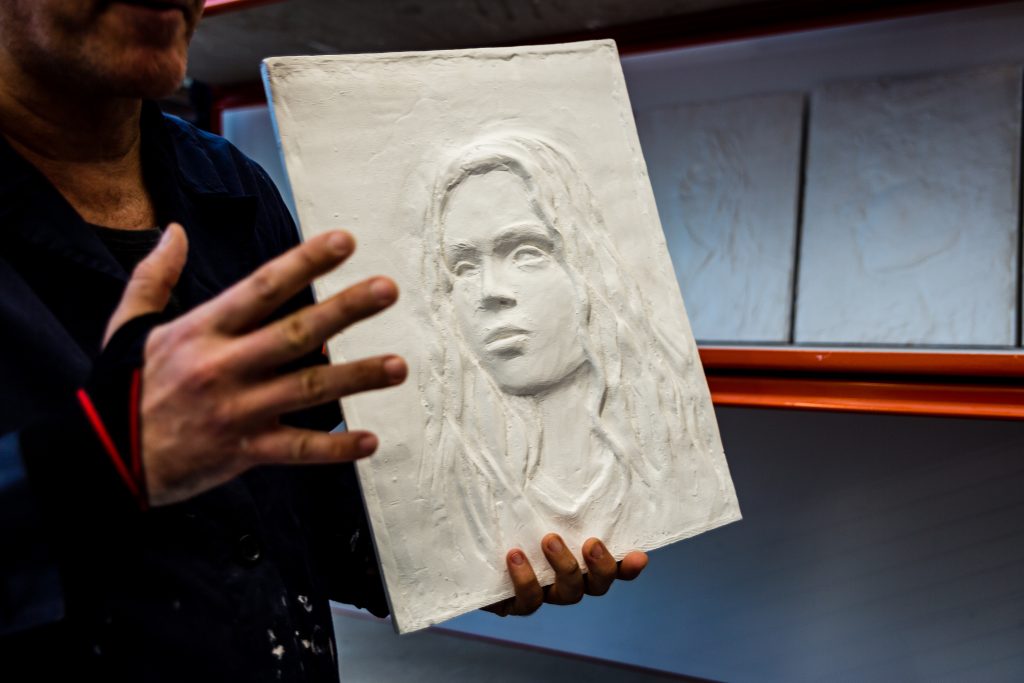
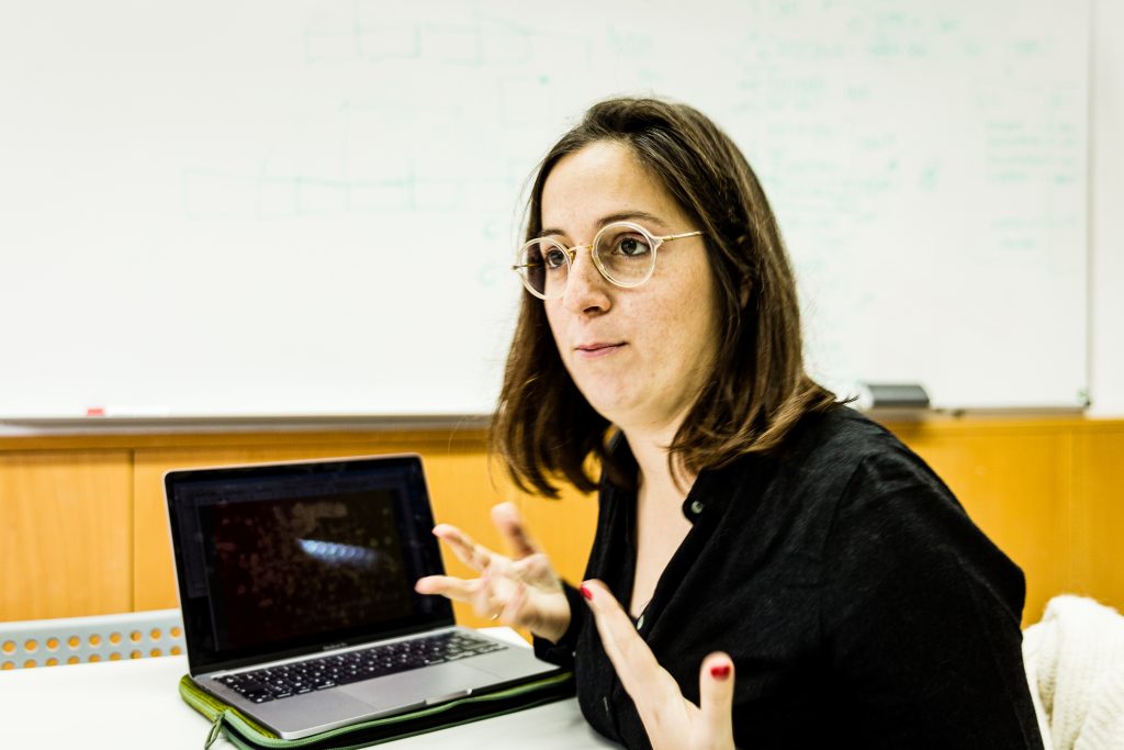
Sónia arrived for a tour of our faculty. We visited the main buildings and exhibition spaces—the ESAD.HaR has a vital component in public art and exhibition design. Hence, it made sense to quickly tour the museum spaces with the Museum curator Luís Nunes. Sónia was also interested in the photography and printmaking workshops as her school has a strong legacy and is very much oriented to the “in-house” Graphic Design production. After a quick tour of these spaces, Prof. Ferro was kind enough to open his classroom door and quickly tour the sculpting and metal founding workshops. Something everyone in our school should visit and know more about—impressively clean and efficient spaces.
We then headed to the South Building to share what our faculties do best. Sonia mostly shared their activities — especially the curatorial and editorial ones. They involve their students in organizing and producing exhibitions and editorial materials, usually with artistic or linguistic legacies.

Moving on, we then proceeded downstairs to the South Building Auditorium for the main conference:
Encounter with the work of Claude Mediavilla
The exhibition Mediavilla – Calligraphie, Typographie, Logotype, designed by Sónia da Rocha, took visitors to discover the different forms of Latin writing through the eyes of Claude Mediavilla, combining teaching material, calligraphy examples, font designs, and pieces of lettering.
Claude Mediavilla is known above all for his calligraphic work and the books he dedicated to the discipline. Highlighting the work Calligraphie – Du signe calligraphié à la peinture abstracte, published by Imprimerie Nationale in 1993 (Spanish version of 2005, by Campgrafic, present in the FBAUP Library).
(Excerpt from the conference promotion email)
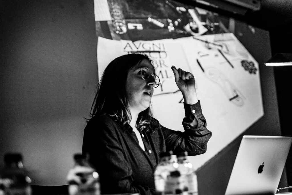
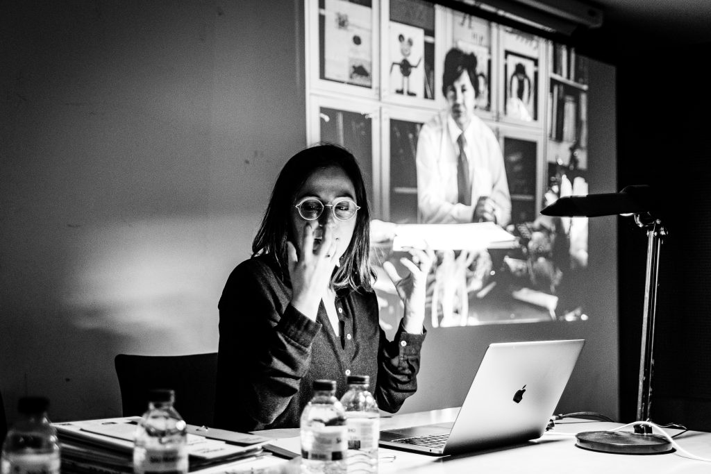
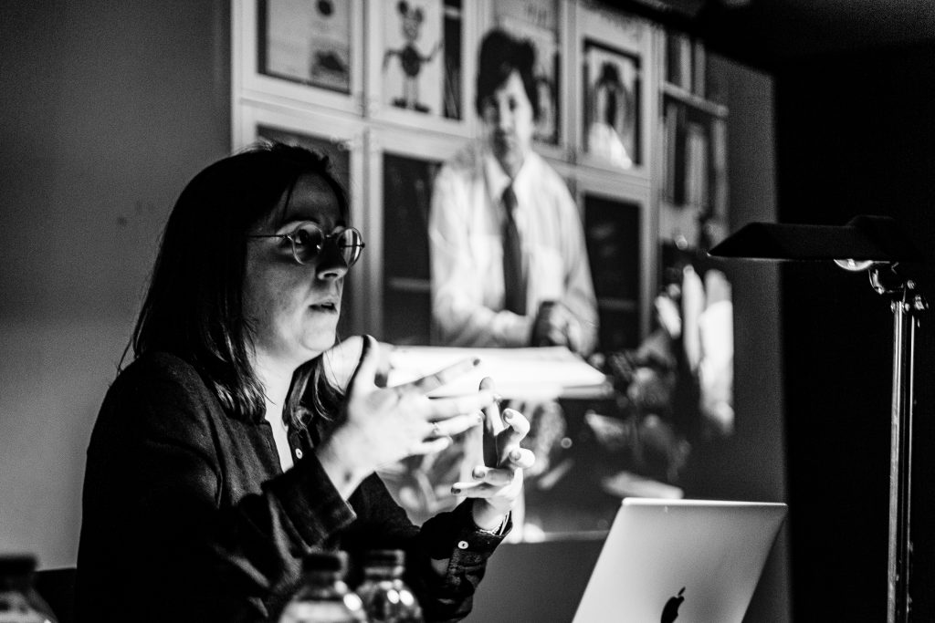
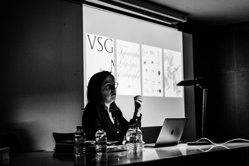
This was the starting point of Sonia’s conference. After a quick introduction and establishing the importance of Mediavilla in the French and the international typographic and calligraphic landscape, she presented us with her “encounter” with her master and teacher.
Mediavilla is also a Graphic Designer and Type Designer, having worked since the mid-70s, with large studios such as TypoGabor and Hollenstein, at a time when the profession was undergoing complete change. He designed fonts and logos for several companies and institutions, such as Air France, Château de Versailles, Hermès, Ministry of Culture, among others. In 1982, he was awarded the Charles Peignot Prize.
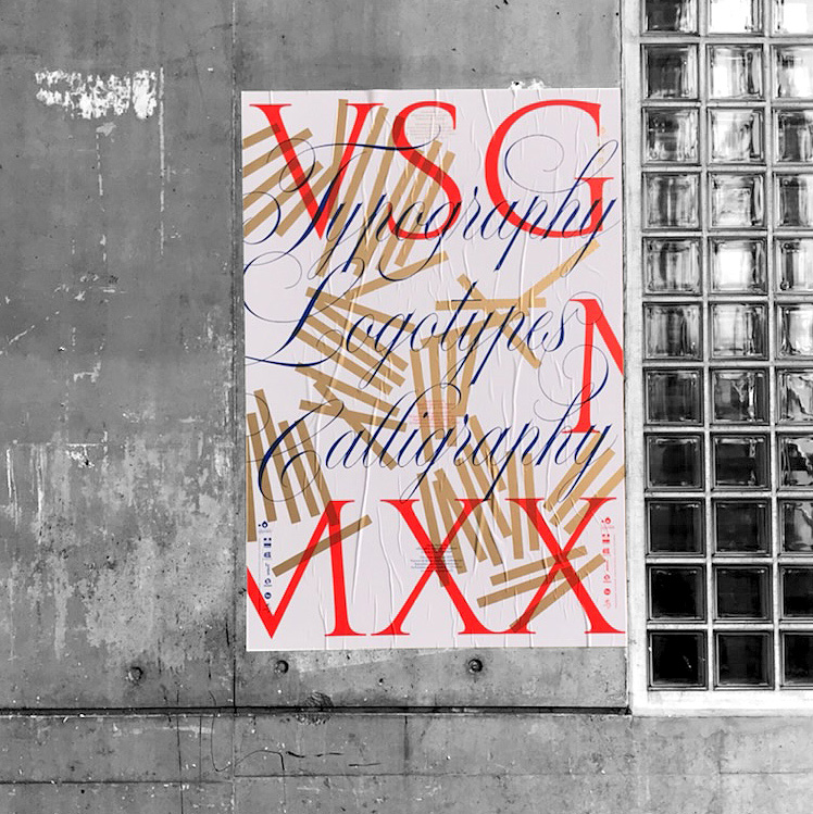
Primarily a practitioner and less of a professor, his work — primarily through Sonia’s lenses — is of the utmost importance. having left us with a series of books, arguably the most important one is his widely translated and still available — Calligraphy.


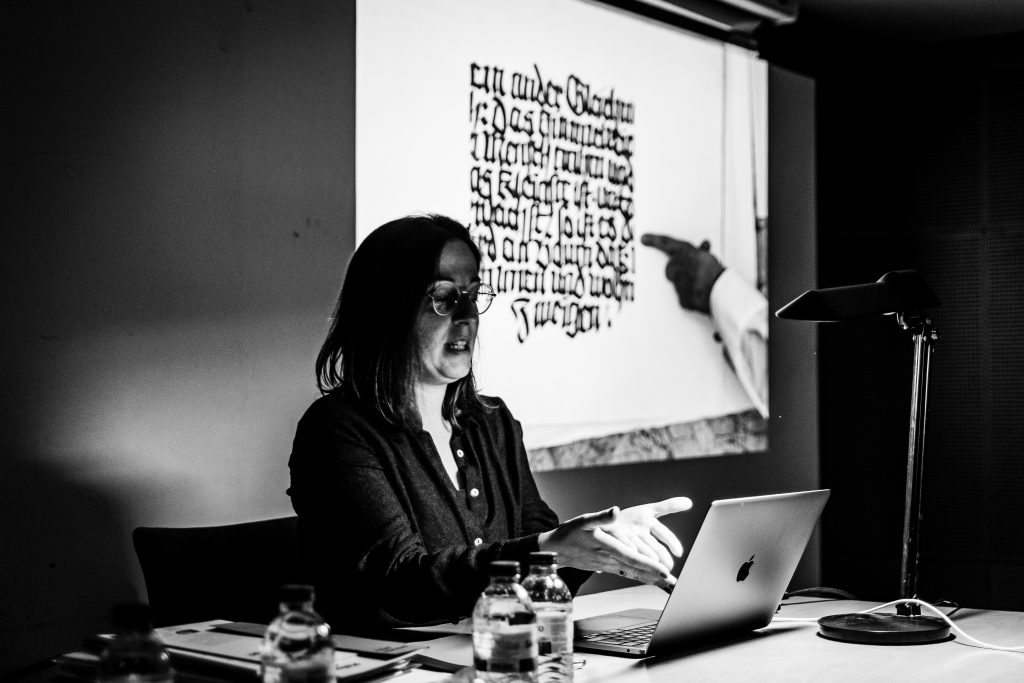
Some highlights were the size and detail Mediavilla put into his practice. being originals or copies, the intricacy of his drawings is impressive.
Sónia presented us not only Mediavilla’s work from his books but, most importantly, shared with us his vision and (digital photographies) of his original ink drawings from the professional world — from a “lost” time, when it was prevalent to render hundreds of drawings a day and production a lot of work by hand (and ink).
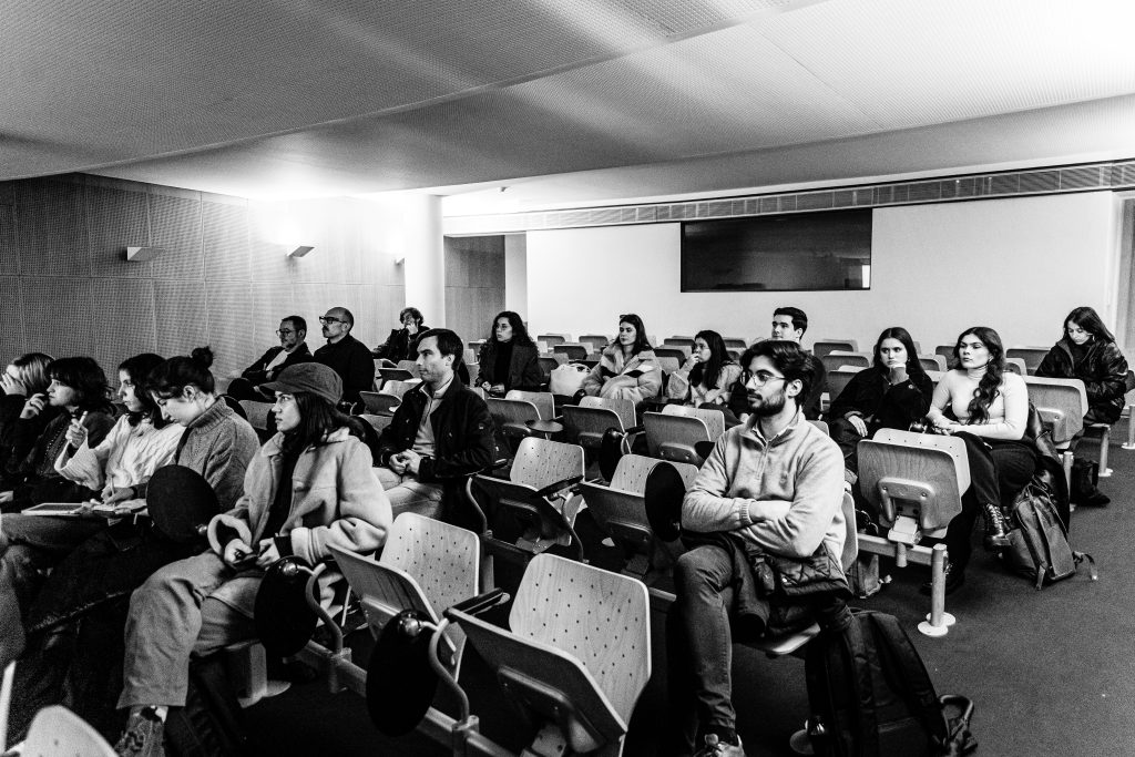
She then explains how she gained access and sifted through the thousands of works throughout the exhibition’s discovery, selection, and assembly that revisits and celebrates the work of this critical Designer, Calligrapher, and Type Designer.
More than a collection of pictures, Sonia left us with a living record of what it was (and still is) to work and learn with such an influential designer and calligrapher. Stories about human relations, work ethics, and the importance of achieving high standards in a professional setting. We had a lovely audience turnaround — for such a particular topic as calligraphy and “old timers” in our school —comprised chiefly of first-year Graphic Design degree students and students from the first and second years of the Master in Graphic Design and Editorial Projects— as everyone seemed to enjoy it, as almost all of them stayed long past the hour to have a small talk with Sónia and browse the catalogs and books she brought with her.
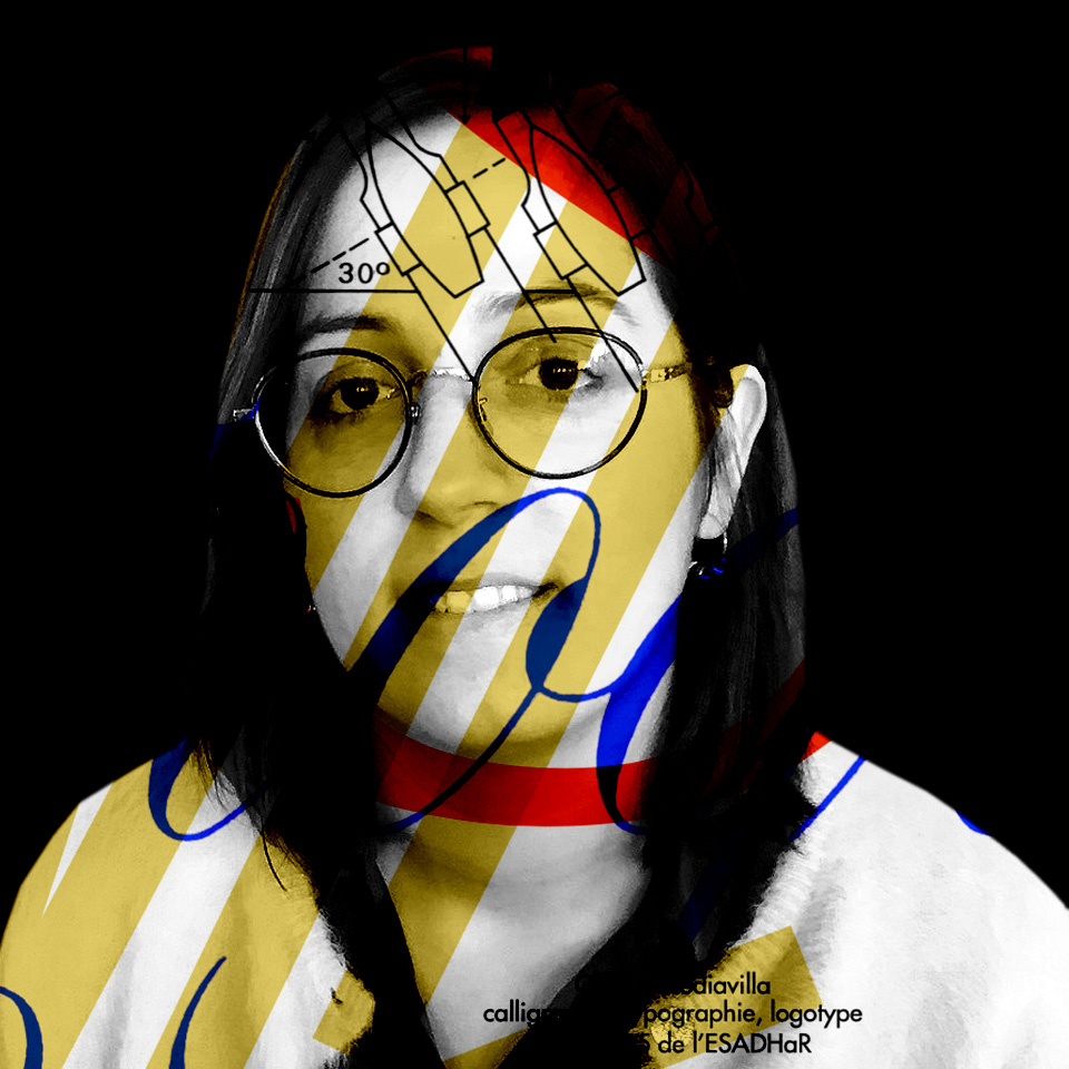
Sónia da Rocha studied graphic design at the Instituto Politécnico do Porto (IPP.ESEIG — currently IPP – ESMAD) before learning calligraphy with Claude Mediavilla in Paris, in 2008. In 2010, she attended the postgraduate course «Typographie & Langage» at the École Supérieure d’Art et de Design d ‘Amiens. At the end of the course, she joined Jean François Porchez’s team (Typofonderie and Zecraft), where she participated in the development of several Typographic Design projects (RATP, Louis Vuitton).
Since 2013, she has been a freelance Calligrapher, Graphic Designer, and Type Designer, having carried out projects for international brands and institutions such as Orchester National du Capitole de Toulouse, Metropolitan Opera New York, FRAC Champagne Ardenne, Le Fresnoy, Yves Saint Laurent.
As a teacher, Sónia collaborated with different institutions (ECV Paris; ESAD Reims) and since 2016, she has been part of the team of teachers at the École Supérieure d’Art et de Design Le Havre – Rouen (ESADHaR), where she teaches Type Design and develops design projects. curating exhibitions around artists’ editorial objects.
